

The Buttons settings allow you to customize the appearance of buttons throughout your store. You can adjust their shape, border style, typography, and text formatting to match your brand and create a consistent user experience.
Steps
- In the theme editor (Customize), click Theme settings.
- Select Buttons.
- Customize the button style and typography settings.
- Save the changes.
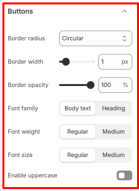
Button Style
Configure the overall appearance of buttons displayed across your storefront.
Border radius
Choose the shape of your buttons.
Available styles determine how rounded the button corners appear, ranging from square edges to fully circular corners.
Border width
Adjust the thickness of the button border.
- Increase the value to make borders more prominent.
- Decrease the value for a cleaner and more subtle appearance.
Border opacity
Control the transparency of button borders.
- Higher values make the border more visible.
- Lower values create a softer, less noticeable border.
This setting is especially useful for outlined button styles.
Typography
Customize the typography used for buttons.
Font family
Choose whether buttons use the Body text font or the Heading font.
- Body text provides a clean and consistent appearance.
- Heading gives buttons a more distinctive and prominent look.
Font weight
Select the thickness of the button text.
Available options include:
- Regular for a lighter appearance.
- Medium for slightly bolder text.
Choose a weight that complements the overall typography of your store.
Font size
Choose the size of the text displayed inside buttons.
Larger button text improves visibility, while smaller text creates a more compact design.
Enable uppercase
Enable this option to display all button text in uppercase.
- Enabled: All button labels appear in uppercase letters.
- Disabled: Button labels use their original capitalization.
Uppercase text can help call-to-action buttons stand out but should be used consistently throughout your store.