
Location- Customiser > Collections > Default Collection
Collection Page Overview
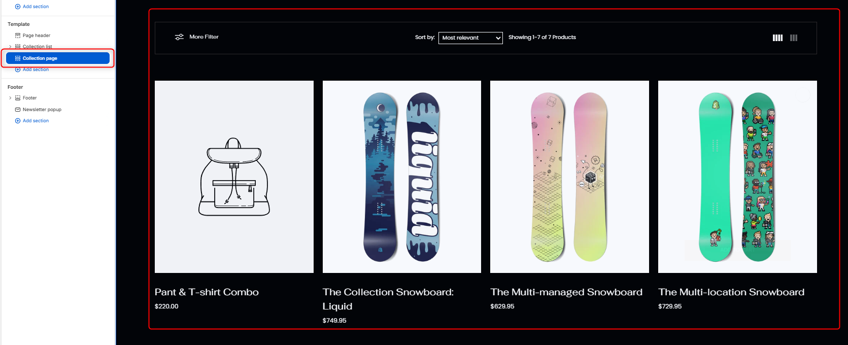
The Collection Page section controls how products are displayed within your collection pages, including layout styles, filtering behavior, product density, and quick view functionality.
General Settings
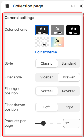
- Color Scheme- Edit and select the color scheme applied to the collection page, including product cards, filters, sorting controls, and page elements.
- Style- Choose the overall visual style used for the collection page section.
- Filter Style: Determines how collection filters are displayed. Either as a Sidebar or Drawer.
- Filter/Grid Position: Controls the arrangement of filters relative to the product grid. Normal displays filters using the default layout order whereas reverse, reverses the positioning of the filters.
- Filter Drawer Position: Determines which side of the screen the filter drawer opens from.
- Products per Page: Controls the number of products displayed on each collection page section.
Quick view popup settings
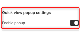
Enable Popup: When enabled, customers can quickly preview product information directly from the products in the collection page without leaving the current page, upon clicking the quick view icon.
Spacing (desktop)
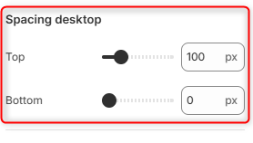
Top: Controls the amount of spacing above the Collection Page section on desktop devices.
Bottom: Controls the amount of spacing below the Collection Page section on desktop devices.
Spacing (mobile)
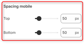
Top: Controls the amount of spacing above the Collection Page section on mobile devices.
Bottom: Controls the amount of spacing below the Collection Page section on mobile devices.