
Location- Customiser > Template > Collection Tab
Collection Tab Overview
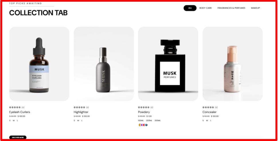
The collection tab enables you to display products related to different collections within a tabbed display.
Collection Tab Settings
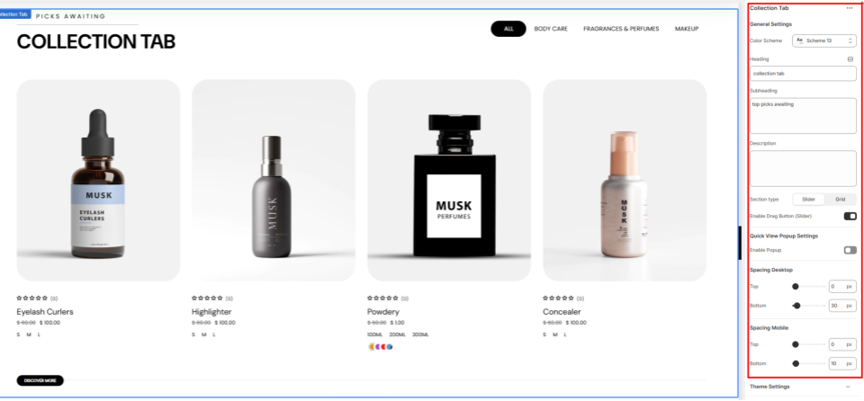
General Settings
- Color Scheme: Enables you to select a color palette to be applied to the Collection Tab section.
- Heading: Enter the text you’d like to display as the main heading of the section.
- Subheading: Within this field, you can add the subheader text content to be rendered above the section’s Heading.
- Description: Provide a description for the section to give customers more context.
- Section Type: Set whether to render the Collection Tab as a Grid or Slider.
- Enable Drag Button: Enable this option to show a drag button beneath the products when the section type is set to slider.
Quick View Popup Settings
- Enable Popup: When enabled, a quick view icon appears on products. Clicking the icon opens a popup displaying the product details.
Spacing (Desktop and Mobile)
Controls the top and bottom spacing of the Collection Tab section on both Desktop and Mobile views.