
Location- Customiser > Template > Collection Tab
Collection Tab Overview
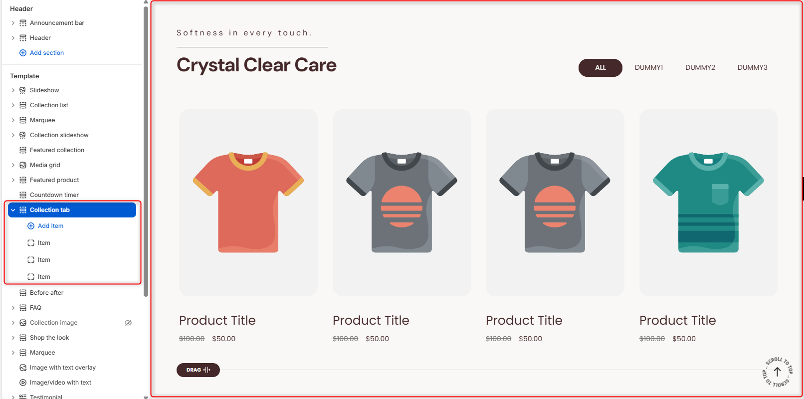
The collection tab enables you to display products related to different collections within a tabbed display.
Collection Tab Settings
General Settings
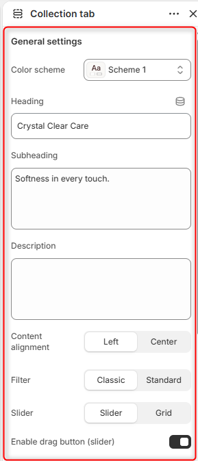
- Color Scheme: Enables you to select a color palette to be applied to the Collection Tab section.
- Heading: Enter the text you would like to display as the main heading of the section.
- Subheading: Within this field, you can add the subheader text content to be rendered above the section’s Heading.
- Description: Enables you to add a longer paragraph explaining the collections. thereby giving customers more context.
- Content alignment: Controls the horizontal positioning of the heading, subheading, and description text.
- Filter: Adjusts the layout style of the tab selection buttons.
- Slider: Dictates how multiple products are displayed. Setting it to Slider enables horizontal swiping/scrolling, while Grid displays products in multiple rows, depending on the set number of columns and product limit.
- Enable drag button (slider): A toggle switch that shows a visual indicator to let users know they can click and drag to view more products.
- Loop: When enabled, the collection Tab continuously cycles through all collection items. This option is available if the Enable drag button (slider) option is disabled.
Quick View Popup Settings
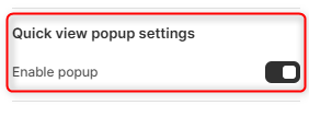
- Enable Popup: When enabled, a quick view icon appears on products. Clicking the icon opens a popup displaying the product details.
Button
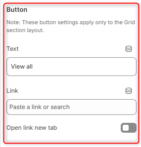
Text: The label for a call-to-action button (typically placed below the grid to view the whole collection).
Link: The URL destination where the button will take the user. It is currently empty.
Open link new tab: A toggle that forces the link destination to open in a completely separate browser tab when clicked.
Spacing Desktop
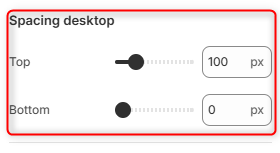
Controls the top and bottom spacing of the Collection Tab section on Desktop layouts.
Spacing Mobile
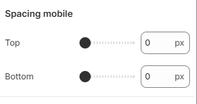
Controls the top and bottom spacing of the Collection Tab section on mobile layouts.
Configuring an Individual “Item” Block
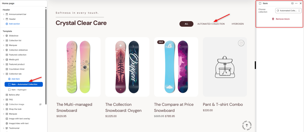
With the help of the Item block, you can add the collection to be rendered within the tab. The theme automatically names the tab based on the collection you select.
Choose collection: This field enables you to select the collection to use on the tab.