
Location- Customiser > Template > Featured Collection
Featured Collection Overview
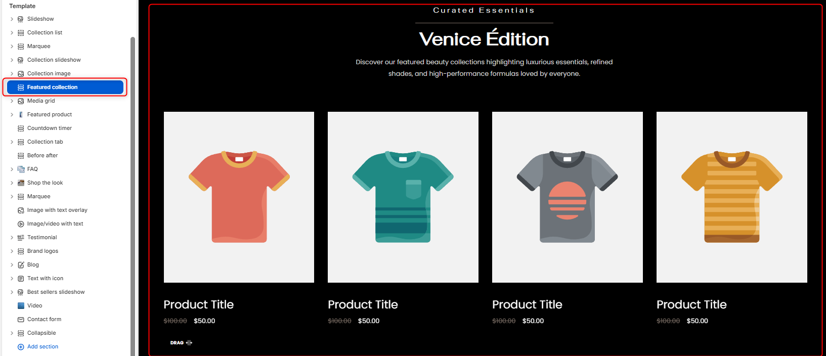
The Featured Collection section enables you to showcase products from one of your specified store’s collections.
Featured Collection Settings
General Settings
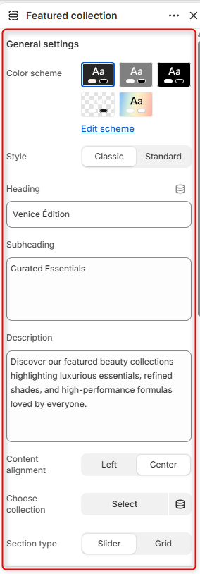
- Color Scheme: Enables you to edit or select a color scheme for your Featured Collection section.
- Style: Determines the appearance of the Featured Collection, whereby in the standard layout the products tend to occupy more with of the row, as compared to the classic layout.
- Heading: Use this field to set the header title text for your Featured Collection section.
- Subheading: Enables you to add supporting text above the heading.
- Description: This can be used to add descriptive text content about your collection, that would appear beneath the heading.
- Content alignment: Controls the alignment of the section heading and text content.
- Choose a collection: This field enables you to specify the collection whose products you wish to have rendered.
- Section Type: Allows you to choose how products are displayed within the section, either as a Slider or Grid layout.
Slider Settings
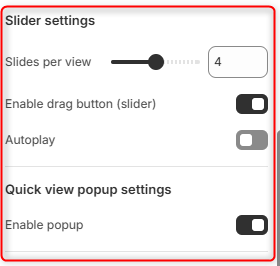
Slides per view: Controls the number of products visible at one time within the slider when the slider section type is selected.
Enable Drag Button (Slider): Displays slider Drag button navigation control. When enabled, customers can easily navigate through products using slider controls.
Autoplay: Automatically advances products within the slider.
Quick View Popup Settings
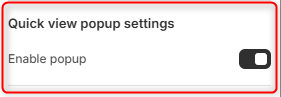
Enable Popup: When enabled, it displays a quick view icon on products that, when clicked, opens a popup with the product details.
Button
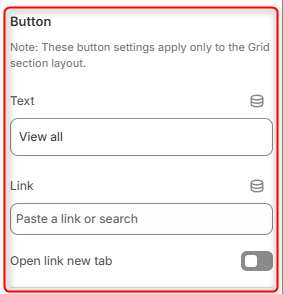
Text: Enables you to define the button label.
Link: Specifies where the button redirects users when clicked on.
Open Link in New Tab: Determines whether the button link opens in a new browser tab when there is a click event on the button.
Spacing (Desktop)
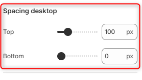
Top: Controls the amount of space above the Featured Collection section on desktop devices.
Bottom: Controls the amount of space below the Featured Collection section on desktop devices.
Spacing (Mobile)
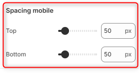
Top: Controls the amount of space above the Featured Collection section on mobile devices.
Bottom: Adjusts the amount of space below the Featured Collection section on mobile devices.