

The Input settings allow you to customize the appearance of input fields of form elements throughout your store. You can adjust their shape, border thickness, and opacity to match your store’s overall design.
Steps
- In the theme editor (Customize), click Theme settings.
- Select Buttons.
- Customize the style of your input fields.
- Save the changes.
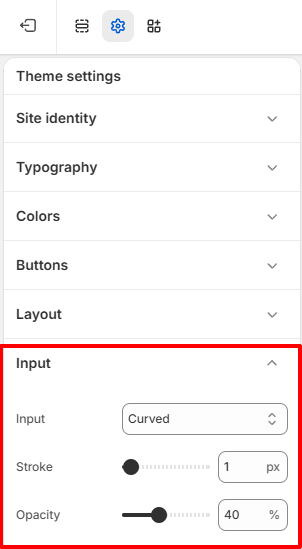
Input Styles
Input
Choose the shape of your input fields.
Available styles determine how the corners of input fields appear, allowing you to match the overall design of your store.
Available options include:
Square – Displays input fields with sharp corners for a clean and minimal design.
Curved – Displays input fields with slightly rounded corners for a modern and balanced appearance.
Circular – Uses fully rounded corners to create a softer, contemporary look.
Stroke
Adjust the thickness of the border surrounding input fields.
- Increase the value for a more defined border.
- Decrease the value for a cleaner and more subtle appearance.
This setting affects form fields such as contact forms.
Opacity
Control the visibility of the input field borders.
- Higher values create a more prominent border.
- Lower values produce a softer, more minimal appearance.