

The Product Cards settings allow you to customize how products are displayed throughout your store, including collection pages, featured product sections, search results, and product recommendations. You can control the card layout, image display, product information, badges, and quick view functionality to create an engaging shopping experience.
Steps
- In the theme editor (Customize), click Theme settings.
- Select Product cards.
- Configure the appearance and functionality of your product cards.
- Save the changes.
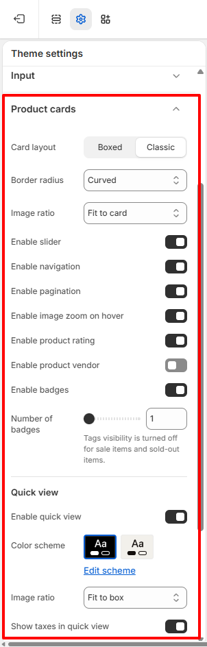
Product Cards
Card layout
Choose the layout style used for product cards.
Available options include:
- Boxed – Displays each product inside a bordered card, creating a more structured and separated layout.
- Classic – Displays products without a surrounding box for a cleaner and more minimal appearance.
Border radius
Choose the corner style for product cards.
Available options include:
- Curved – Slightly rounded corners for a modern appearance.
- Circular – Fully rounded corners for a softer design.
- Square – Sharp corners for a clean and minimal layout.
Image ratio
Choose how product images are displayed within the product card.
Available options include:
Adaptive image – Displays product images using their original aspect ratio. The height of each product card automatically adjusts based on the image dimensions, making it suitable for showcasing products with different image orientations.
Fit to card – Scales the product image to fit within the product card while preserving its original aspect ratio. This option ensures the entire image remains visible and is ideal for stores with products of varying image dimensions.
Enable slider
Enable this option to display multiple product images as a slider within the product card.
When enabled, customers can browse additional product images directly from the product card without opening the product page.
Enable navigation
Display previous and next navigation controls for the product image slider.
This option is available when Enable slider is turned on.
Enable pagination
Display pagination indicators for the product image slider.
Pagination helps customers understand how many images are available for each product.
This option is available when Enable slider is turned on.
Enable image zoom on hover
Enable a zoom effect when customers hover over product images.
This interaction helps highlight product details and creates a more engaging browsing experience.
Enable product rating
Display product ratings on product cards.
Enable product vendor
Display the product vendor or brand name on product cards.
Enable badges
Display product badges such as Sale, Sold Out, or other supported labels.
Badges help customers quickly identify product status and promotional offers.
Number of badges
Choose the maximum number of badges displayed on each product card.
Increasing this value allows more badges to appear, while reducing it creates a cleaner product presentation.
Quick View
The Quick View settings control how customers can preview products without leaving the current page.
Enable quick view
Enable a Quick View button on product cards.
When enabled, customers can quickly view product details and purchase options from a popup without navigating to the product page.
Color scheme
Select the color scheme used for the Quick View popup.
Choose one of your configured color schemes to ensure the popup matches your store’s branding.
To customize a color scheme, click Edit scheme.
Image ratio
Choose how product images are displayed within the Quick View popup.
This setting controls the presentation of product images without affecting the product card image ratio.
Show taxes in quick view
Enable this option to display tax information within the Quick View popup.
This helps customers understand whether taxes are included in the displayed product price before proceeding to checkout.