
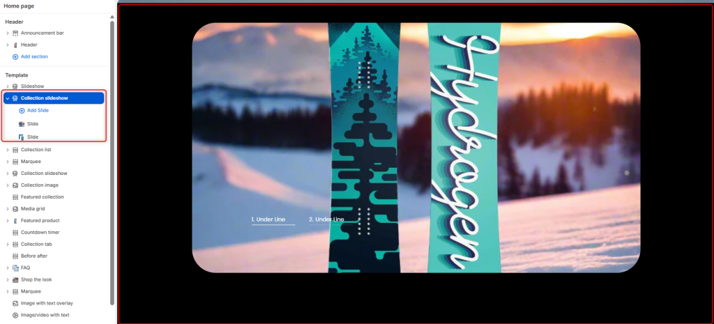
The Collection Slideshow section allows you to showcase collections in an interactive slideshow format. You can present your collections using either a Vertical or Horizontal carousel layout and customize the navigation style to match your store’s branding.
Collection Slideshow Settings
Section Setting
Color scheme: Determines the color palette applied to the Collection Slideshow section.
Carousel style: Changes the slider’s visual structure or layout mode. It can be set to either Horizontal or Vertical.
Navigation style: Alters the design aesthetic of the carousel’s navigation elements.
Navigation layout: Controls the shape container of the navigation buttons.
Loop: A toggle switch that determines whether the slideshow continuously cycles back to the first slide after reaching the last one.
Border radius
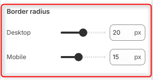
Desktop: Adjusts the roundness of the slideshow’s corners on desktop screens.
Mobile: Adjusts the roundness of the slideshow’s corners specifically for mobile layouts.
Spacing desktop
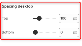
Top: Controls the outer vertical spacing/margin above the slideshow section on desktop views.
Bottom: Controls the outer vertical spacing/margin below the slideshow section on desktop views.
Spacing mobile
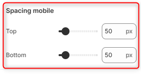
Top: Controls the outer vertical spacing above the slideshow section on mobile screens.
Bottom: Controls the outer vertical spacing below the slideshow section on mobile screens.