
Location: Customizer → Theme settings → Global Color
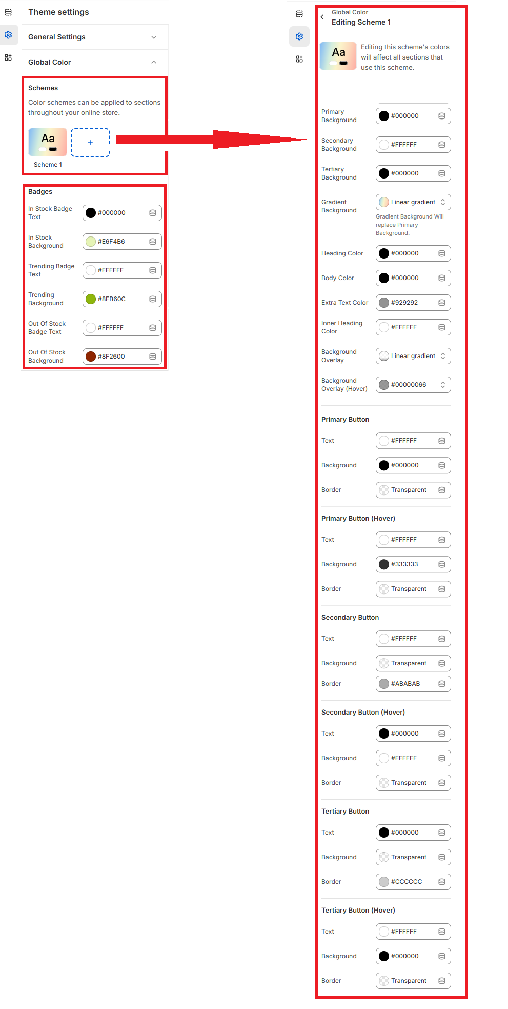
Schemes
Color schemes define the visual style of sections and can be applied site-wide.
- Primary / Secondary / Tertiary Background: Core color layers for backgrounds.
- Gradient Background: Replaces the primary,secondary,tertiary background with a gradient.
- Heading / Body / Extra Text / Inner Heading Color: Customizes all color types.
- Background Overlay (Normal / Hover): Applies a layered visual effect.
Buttons (Color Roles)
- Primary Button / Hover: Text, background, and border settings.
- Secondary Button / Hover: Text, background, and border settings.
- Tertiary Button / Hover: Text, background, and border settings.
Badges
- In Stock Badge Text / Background: Text, background color settings.
- Trending Badge Text / Background: Text, background color settings.
- Out of Stock Badge / Background: Text, background color settings.