
Location- Customiser > Header
Header Overview
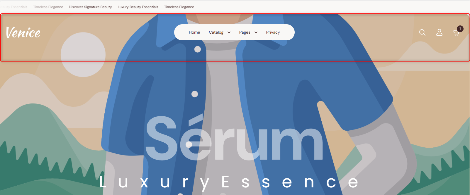
The header section is displayed at the top of your store pages. It is mainly used to render menu navigation items, the search icon, the account icon, the cart icon, and the logo.
Header Settings
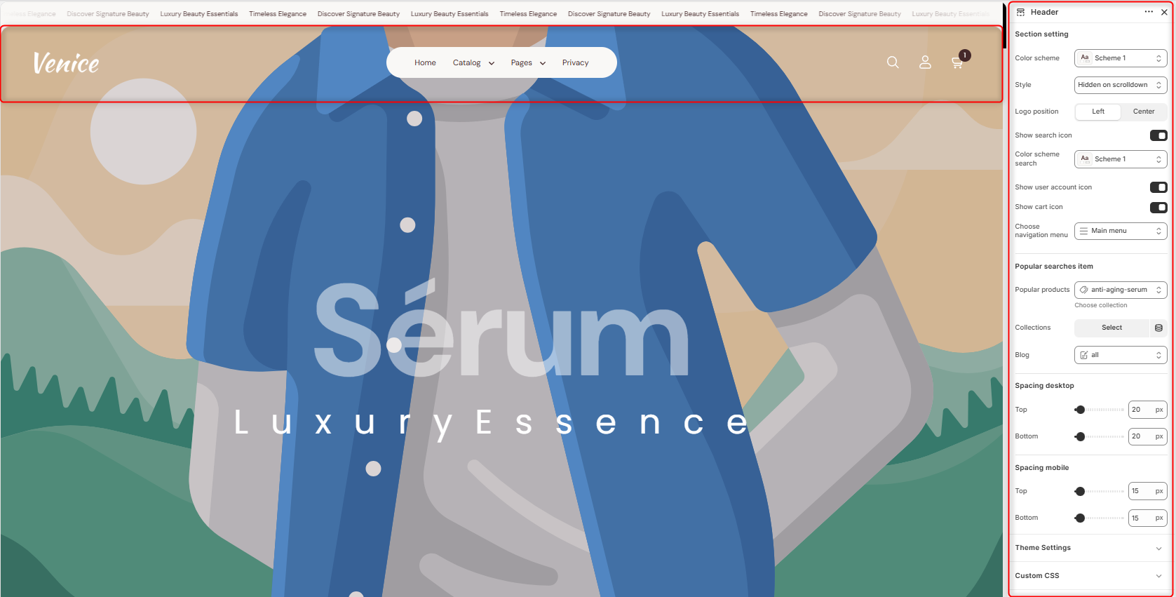
Section Settings
- Color Scheme: Enables you to select a pre-defined color scheme to be applied to your header.
- Style: Determines the behaviour of the Header on scroll.
- Logo Position: Specifies where the logo will be displayed within the header layout.
- Show Search icon: Toggles the display of the search icon within the header.
- Color Scheme search: Allows you to customize the color scheme applied to the search element in the header.
- Show User Account Icon: Hide/Show the Account icon on the header.
- Show Cart Icon: Enable/Disable the Cart Icon display on the header.
- Choose Navigation Menu: Enables the selection of the menu to be rendered on the header.
Popular Searches Item
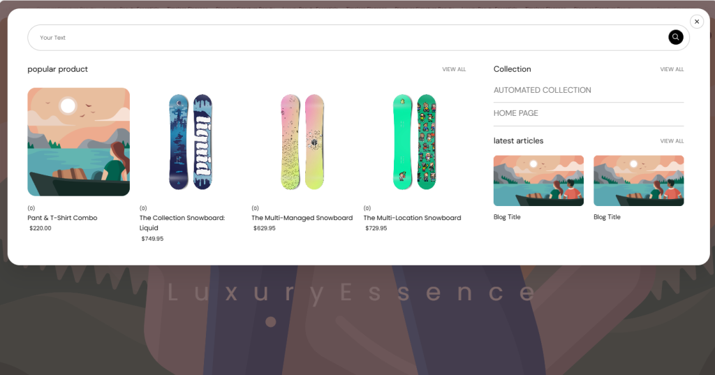
Popular Products: Within the setting here, you can choose which collection’s products will appear in the Popular Products area.
Collection: This field enables you to set the popularly searched collections that are to appear in the Collection area.
Blog: Enables you to set the blog whose posts will be displayed in the Latest articles section.
Spacing Desktop and Spacing Mobile
Controls the top and bottom spacing of the header section in both desktop and mobile views.
Configurable Blocks in the Header Section
Mega menu
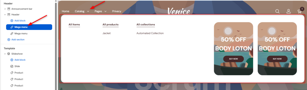
Allows you to create a large, customizable dropdown menu that can display multiple menu items under a primary navigation item. It can also be used to showcase featured products, promotional content, images, banners, and other custom elements to enhance site navigation and visibility.
Mega menu Settings
Settings
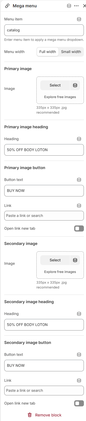
Menu Item: Enables you to add the primary menu item that will trigger the Mega Menu dropdown when hovered over.
Menu Width: Controls the width of the Megamenu dropdown.
Primary Image
Image: Enables you to upload the promotional image displayed in the first promotional area of the Mega Menu.
The recommended image size is 335px × 335px (.jpg).
Primary Image Heading: Allows for the addition of a heading or promotional text to display over or alongside the primary image.
Primary Image Heading
Heading: Enables you to add a heading or promotional text to display over or alongside the primary image.
Primary image button
Button Text: Lets you add a label displayed on the call-to-action button.
Link: Provides a field to add the destination URL when the button is clicked.
Open Link in New Tab: When enabled, the linked page opens in a new browser tab.
Secondary Image
Image: Provides a field to enable you to select the promotional image displayed in the second promotional area of the Mega Menu.
Secondary image heading
Heading: Lets you add a promotional text to display over or alongside the secondary image.
Secondary Image Button
Button Text: Provides a field to set the label displayed on the call-to-action button.
Link: Enables you to add the destination URL when the button is clicked.
Open Link in New Tab: When enabled, the linked page opens in a new browser tab.