

Location: Customizer > Template > Slideshow
Slideshow Overview
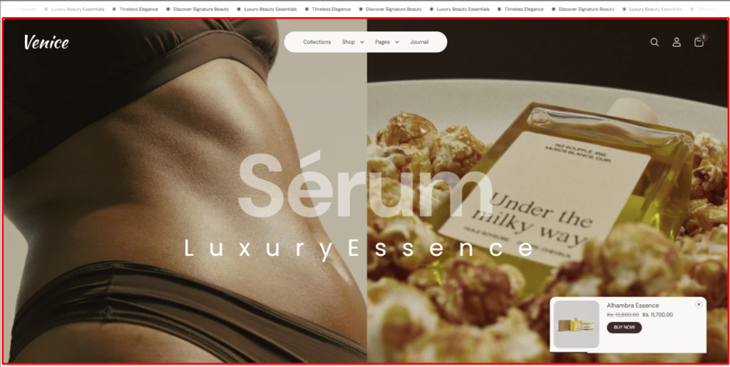
The Slideshow section allows you to showcase multiple slides with customizable layouts, controls, and product showcase options.
Slideshow Settings
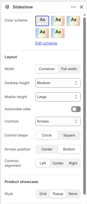
Color scheme: Select the color scheme for the slideshow.
Layout
Width: Choose between Container or Full width.
Desktop height: Set the slideshow height on desktop devices.
Mobile height: Set the slideshow height on mobile devices.
Autorotate slide: Enable or disable automatic slide rotation.
Controls: Choose the slideshow navigation style, such as Arrows.
Control shape: Choose between Circle or Square.
Arrows position: Choose whether the arrows appear in the Center or Bottom.
Controls alignment: Choose the horizontal alignment of the controls: Left, Center, or Right.
Product Showcase
Style: Choose the product showcase style: Grid, Popup, or None.
Border Radius
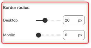
Desktop: Adjusts the corner roundness of the slideshow slide(s) on desktop devices.
Mobile: Adjusts the corner roundness of the slideshow slide(s) on mobile devices.
Padding
Devices: Choose whether to configure padding for Desktop or Mobile devices.
Top: Set the top padding of the section from 0–500px.
Bottom: Set the bottom padding of the section from 0–500px.
Slide Block
The Slide block allows you to create individual slides with separate desktop and mobile media, customizable content, buttons, and overlays.
Desktop Media
Type: Choose the media type for desktop: Image or Video.
Mobile Media
Type: Choose the media type for mobile: Image or Video.
Content
Subheading: Add a subheading to the slide.
Heading: Add the main heading for the slide.
Description: Add a description to the slide.
Alignment: Choose the content alignment: Left, Center, or Right.
Enlarge Heading: Enable or disable an enlarged heading style.
Overlay: Select a color for the media overlay.
Overlay Opacity: Set the overlay opacity from 0–100%.
Primary Button
Text: Add the label for the primary button.
Link: Add the destination link for the primary button.
Open link in new tab: Choose whether the button link opens in a new browser tab.
Secondary Button
Text: Add the label for the secondary button.
Link: Add the destination link for the secondary button.
Open link in new tab: Choose whether the button link opens in a new browser tab.
Product Block
The Product block allows you to showcase a specific product within the slideshow.
Choose product: Select the product to display in the product showcase.
Marquee Block
The Marquee block allows you to add scrolling text with optional images to the slideshow.
Marquee 1
Text: Add the text for the first marquee.
Font size: Choose the text size: Small, Medium, Large, X-Large, or XX-Large.
Font family: Select the font family for the marquee text.
Image: Select an image to display with the marquee text.
Image width: Set the image width from 0–200px.
Image height: Set the image height from 0–200px.
Marquee 2
Text: Add the text for the second marquee.
Font size: Choose the text size: Small, Medium, Large, X-Large, or XX-Large.
Font family: Select the font family for the marquee text.
Image: Select an image to display with the marquee text.
Image width: Set the image width from 0–200px.
Image height: Set the image height from 0–200px.