
Location- Customizer > Collection List > Template > List Collection
List Collection Overview
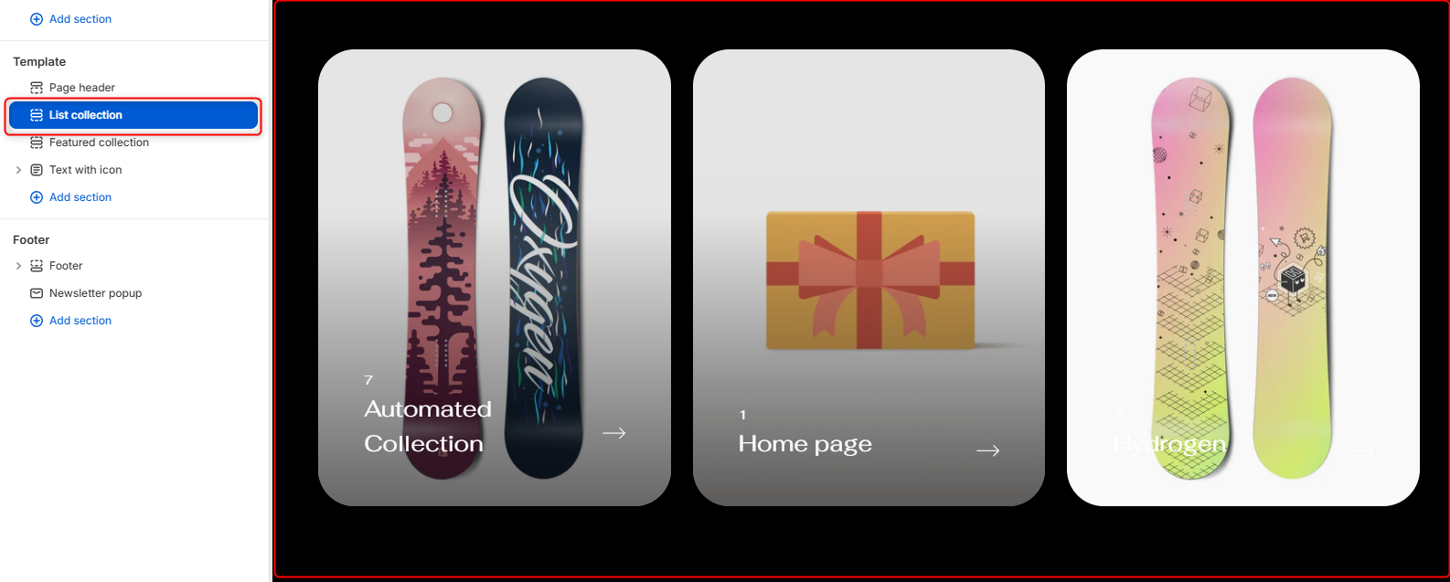
The List Collection section allows you to showcase your store’s collections in a visually engaging card-based layout. Each collection card displays the collection image, product count, title, and a link indicator, making it easy for customers to browse and navigate your catalog.
This also have a feature to show the names of the products that falls under the collection that enables when someone hovers over the card (you can either enable or disable it)
The names are clickable and allow the user to redirect directly to the product information page if clicked on the product or if the user clicks on the collection card he will be redirected to the collection page.
List Collection Settings
General Settings
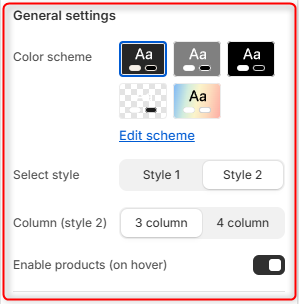
- Color Scheme- Enables you to edit and select the color scheme applied to the entire List Collection section
- Select Style- Controls the overall presentation of the collection cards.
- Column (Style 2)- Controls the number of collection cards displayed per row when Style 2 is selected.
- Enable Products (On Hover)- Enable or disable the appearing of product titles when you hover on the collection card.
Border Radius
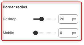
Desktop: Adjusts the corner rounding of collection cards on desktop devices.
Mobile: Adjusts the corner rounding of collection cards on mobile devices.
Section spacing (desktop)
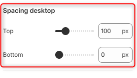
Top: Controls the amount of spacing above the List Collection section on desktop devices.
Bottom: Controls the amount of spacing below the List Collection section on desktop devices.
Section spacing (mobile)
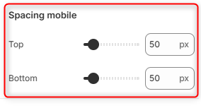
Top: Controls the amount of spacing above the List Collection section on mobile devices.
Bottom: Controls the amount of spacing below the List Collection section on mobile devices.