
Location- Customiser > Template > Shop The Look
Shop The Look Overview
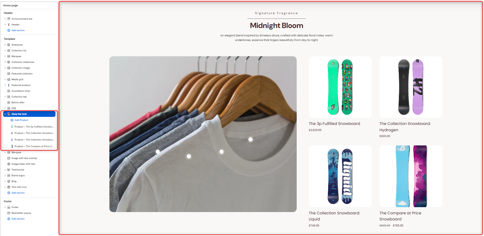
The section enables you to showcase a styled image alongside shoppable products. Customers can view a curated “look” and purchase individual items directly.
Shop The Look Settings
General Settings
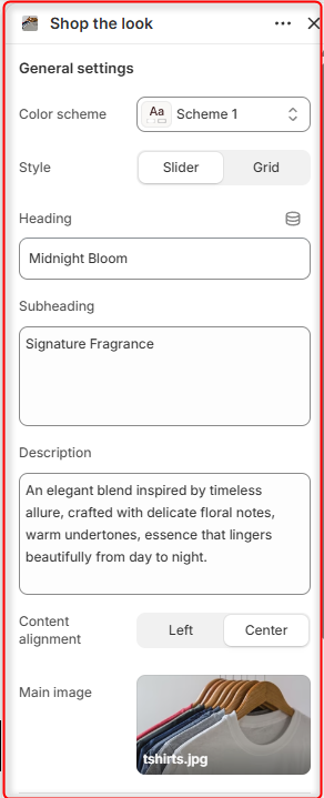
- Color Scheme: Choose and customize the color scheme applied to the entire section.
- Style: Enables you to specify how the featured products are displayed, either as a Grid or Scrollable carousel.
- Heading: Within this field, you can add the main title for the section.
- Subheading: Here you can add supporting text to be displayed above the heading.
- Description: Add supporting text to describe the featured products, look, or promotional content.
- Content Alignment: Controls the alignment of the section heading, subheading, and description to either the left or center.
- Main Image: Upload the primary image that will contain the interactive product hotspots.
Border Radius
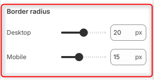
Desktop: Adjusts the corner rounding of the main image and associated content containers on desktop devices.
Mobile: Adjusts the corner rounding of the main image and associated content containers on mobile devices.
Spacing desktop
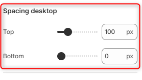
Top: Controls the amount of spacing above the Shop the Look section on desktop devices.
Bottom: Controls the amount of spacing below the Shop the Look section on desktop devices.
Spacing Mobile
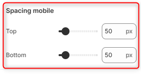
Top: Controls the amount of spacing above the Shop the Look section on mobile devices.
Bottom: Controls the amount of spacing below the Shop the Look section on mobile devices.
Shop the Look Product Block
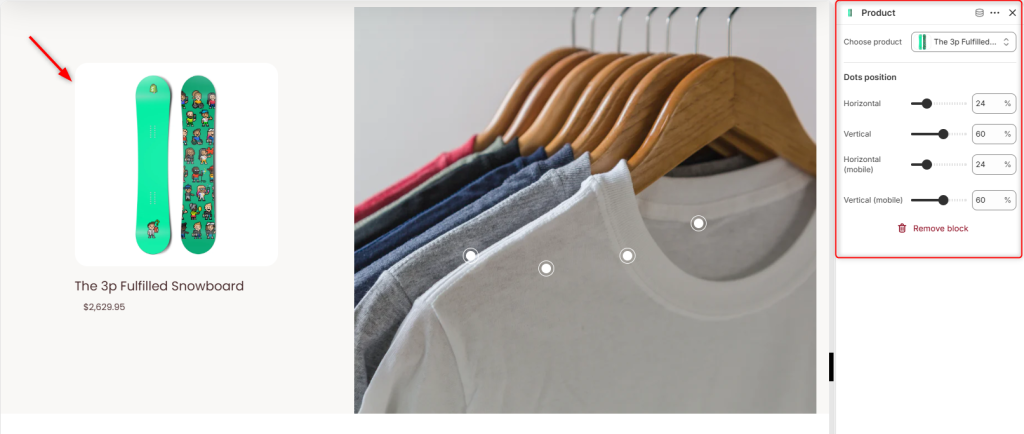
The Product block allows you to add a product to the Shop the Look section, which is then associated with a hotspot dot on the main image. When customers interact with the hotspot, they can quickly identify and explore the corresponding product featured in the look.
Using the Dots position settings, you can control the placement of the hotspot marker on the main image.