
Location- Customiser > Template > Testimonial
Testimonial Overview
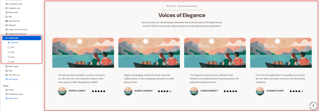
The Testimonial section allows you to showcase customer reviews and feedback in an attractive carousel layout. Display client experiences, ratings, and testimonials to build trust, credibility, and social proof for your brand and products.
Testimonial Settings
General Settings
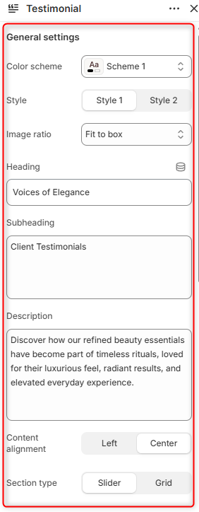
- Color Scheme: Enables you to customize and select the color scheme applied to the entire Testimonial section.
- Style: Here, you can choose the layout style to be used for displaying testimonials.
- Image Ratio: Controls how testimonial images are displayed within their containers. Fit to Box ensures images fit neatly within the available container while maintaining their proportions. Adaptive Image displays images using their original aspect ratios.
- Heading: Allows you to define the main title displayed within the section.
- Subheading: Allows you to add and display a smaller heading above the main title.
- Description: Here you can add supporting text that introduces the testimonial section and provides additional context.
- Content Alignment: Controls the alignment of the heading, subheading, and description.
- Section Type: Determines the layout to be applied to the Testimonials. Either a Grid or Slider Layout.
Border radius
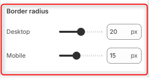
Desktop: Adjusts the corner rounding of testimonials’ main images and content containers on desktop devices.
Mobile: Adjusts the corner rounding of testimonials’ main images and content containers on mobile devices.
Slider Settings
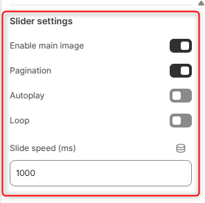
Enable Main Image: Toggles the display of the main testimonial images within the respective portfolios
Pagination: Displays navigation dots below the testimonial slider, allowing customers to navigate between testimonial slides.
Autoplay: Automatically triggers the testimonial slides display in a slide format.
Loop: Continuously loops the testimonial slider when the last slide is reached.
Slide Speed (ms): Controls the speed of the slide transition in milliseconds.
Client Rating
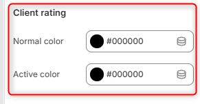
Normal Color: Select the color used for inactive or unselected rating icons.
Active Color: Select the color used for active or highlighted rating icons.
Button
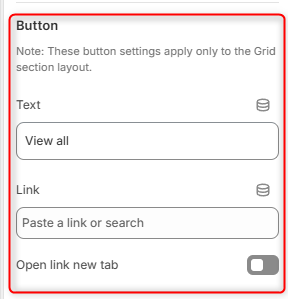
Text: Defines the label displayed on the call-to-action button.
Link: Select the destination page, collection, product, or custom URL that visitors will be directed to when clicking the button.
Open Link in New Tab: When enabled, the button link opens in a new browser tab.
Spacing Desktop
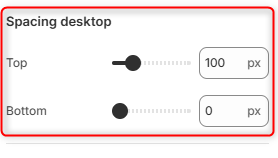
Top: Controls the amount of spacing above the Testimonial section on desktop devices.
Bottom: Controls the amount of spacing below the Testimonial section on desktop devices.
Spacing Mobile
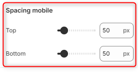
Top: Controls the amount of spacing above the Testimonial section on mobile devices.
Bottom: Controls the amount of spacing below the Testimonial section on mobile devices.
Testimonial Item Block Settings
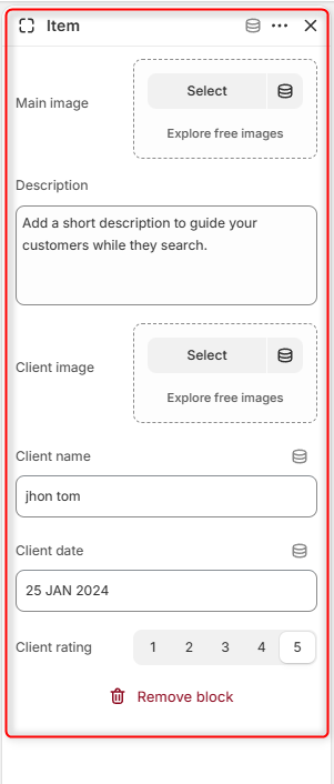
The Testimonial Item block is used to add the respective testimonials to the Testimonial section.
Main Image: Upload the primary image displayed for the testimonial card.
Description: Enter the testimonial text, customer feedback, or review that will be displayed within the testimonial card.
Client Image: Upload an image of the testimonial author, such as a profile picture or avatar.
Client Name: Specify the name of the customer providing the testimonial.
Client Date: Enter the date associated with the testimonial or review.
Client Rating: Select the customer’s rating.