
Location- Customizer > Template > Text with Icon
Icon With Text Overview
The Text with Icon section allows you to highlight key features, services, or brand values using a combination of icons and supporting text.
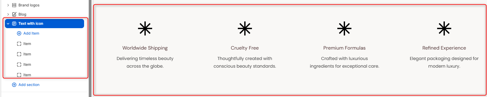
This section is used to highlight important features relating to your store, such as shipping, payments, and refunds, using a combination of icons and text.
Text With Icon Settings
General Settings
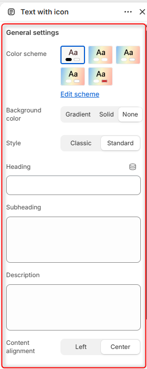
- Color Scheme: Enables you to customize and choose a color palette to apply to the Text With Icon section.
- Background Color: Enables you choose the background style for the section. Selecting Gradient displays a gradient background, Solid displays a solid background color, and None does not enforce any background styling.
- Style: Enables you to select the layout style used for the icon items.
- Heading: Defines the main title displayed within the section.
- Subheading: Allows you to add a smaller heading above the main title.
- Description: Here you can add supporting text to provide additional information or context for the Text With Icon section.
- Content Alignment: Controls the alignment of the heading, subheading, and description.
Border Radius
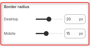
Desktop: Adjusts the corner rounding of the Text With Icon item cards on desktop devices.
Mobile: Adjusts the corner rounding of the Text With Icon item cards on mobile devices.
Spacing (desktop)
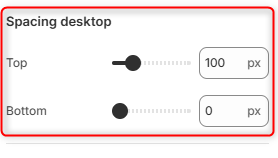
Top: Controls the amount of spacing above the Text with Icon section on desktop devices.
Bottom: Controls the amount of spacing below the Text with Icon section on desktop devices.
Spacing (Mobile)
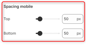
Top: Controls the amount of spacing above the Text with Icon section on mobile devices.
Bottom: Controls the amount of spacing below the Text with Icon section on mobile devices.
Text With Icon Item Block Settings
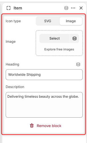
Each entry within the Text with icon section is added through an individual Item block.
Icon Type : Enables you to select the type of icon to display on the Text with Icon cards.
Image: Here you can upload the image to be displayed as the icon when Image is selected as the icon type.
Icon SVG: Here you can enter the SVG markup to display when SVG is selected as the Icon Type.
Heading: Enter the title or label displayed below the icon.
Description: Here you can add supporting text that provides additional information about the icon item.