
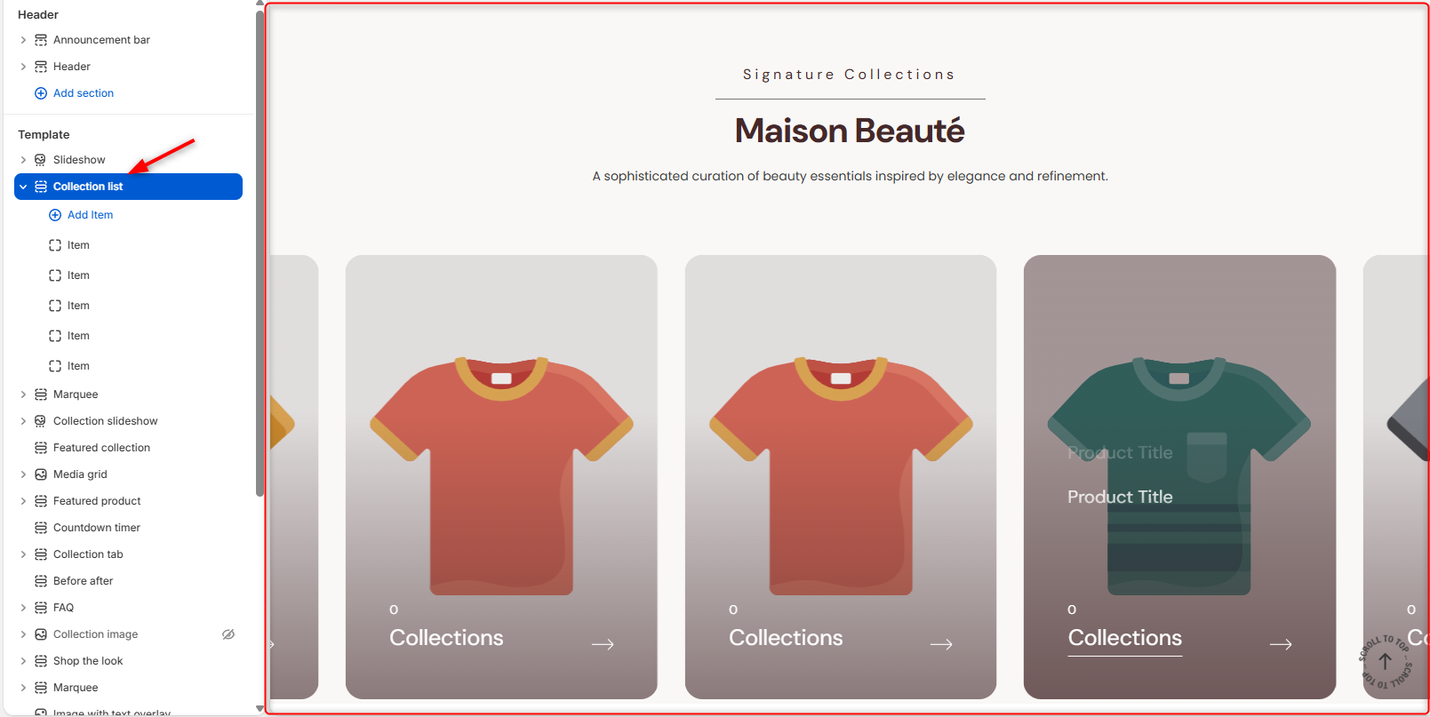
Location- Customiser > Template > Collection List
Collection List Overview
The Collection List section allows you to showcase multiple product collections in a visually appealing slider layout.
Collection List Settings
General Settings
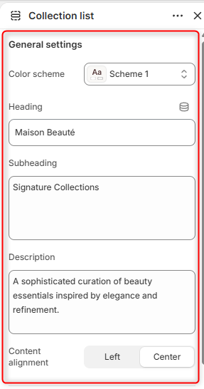
- Color Scheme- Enables you to customize and set the colour Scheme you want applied to the Collection List section and its contents.
- Heading- Add the Heading / Title for the collection section you want
- Subheading- Specifies the secondary heading displayed above the main heading.
- Description- Provides a short description or introductory text displayed beneath the section heading.
- Content Alignment- Set the alignment for the Heading , subheading and the Description text either left or centered.
Border Radius
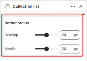
Desktop: Adjusts the corner roundness of collection cards on desktop devices.
Mobile: Adjusts the corner roundness of collection cards on mobile devices.
Slider Settings
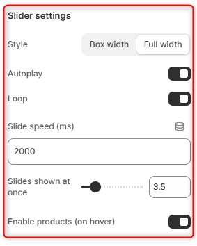
Style: Controls the width of the Collection List container. Box Width displays the section within the theme’s content width, whereas Full Width expands the section across the full available width.
Autoplay: Automatically advances collection slides without requiring user interaction.
Loop: When enabled, the collection slider continuously cycles through all collection items.
Slide Speed (ms): Specifies the duration, in milliseconds, between automatic slide transitions.
Slides Shown at Once: Controls the number of collection cards visible simultaneously within the slider.
Enable Products (on Hover): When enabled, it displays product titles from the selected collection when a visitor hovers over a collection card.
Section Spacing (Desktop)
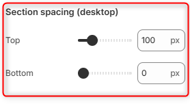
Top: Adjusts the amount of spacing above the Collection List section on desktop devices.
Bottom: Adjusts the amount of spacing below the Collection List section on desktop devices.
Section Spacing (Mobile)
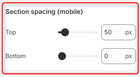
Top: Adjusts the amount of spacing above the Collection List section on mobile devices.
Bottom: Adjusts the amount of spacing below the Collection List section on mobile devices.