

Location - Customiser > Template > Collection Carousel
Collection Carousel Overview
The Collection Carousel section allows you to showcase multiple collections in a customizable carousel layout.
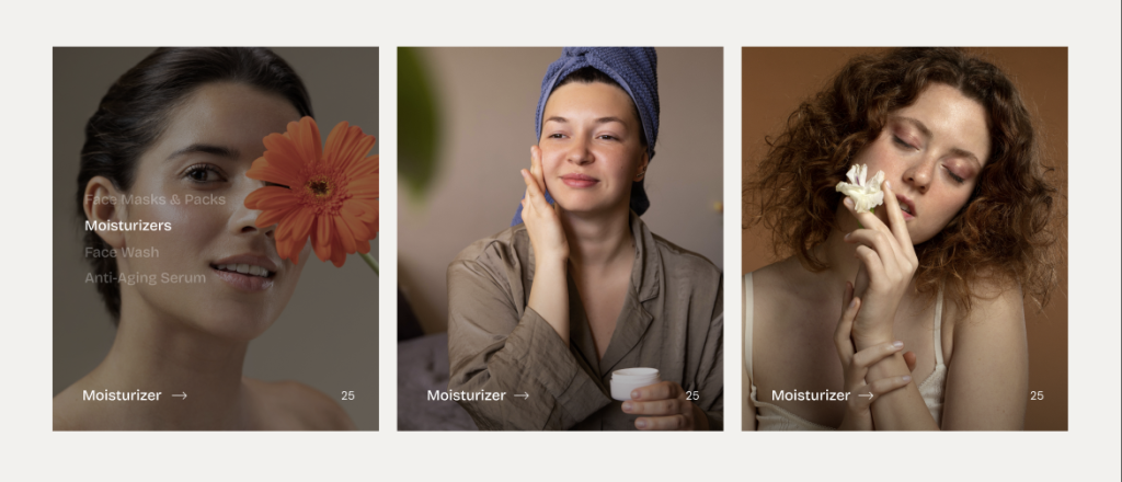
General Settings
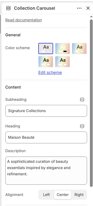
Color scheme: Select the color scheme for the section.
Content
Subheading: Add a subheading for the section.
Heading: Add the main heading for the section.
Description: Add a description for the section.
Alignment: Choose the content alignment: Left, Center, or Right.
Layout
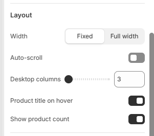
Width: Choose between Fixed or Full width.
Auto-scroll: Enable or disable automatic scrolling of collections.
Scroll speed: Set the auto-scroll speed from 1–10.
Desktop columns: Choose the number of collections displayed per row: 3, 4, or 5.
Product title on hover: Enable or disable displaying the product title when hovering over a collection.
Show product count: Enable or disable displaying the number of products in each collection.
Border Radius
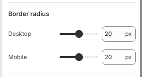
Desktop: Adjusts the corner roundness of collection cards on desktop devices.
Mobile: Adjusts the corner roundness of collection cards on mobile devices.
Padding
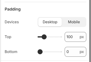
Devices: Choose whether to configure padding for Desktop or Mobile devices.
Top: Set the top padding of the section.
Bottom: Set the bottom padding of the section.
Collection Block
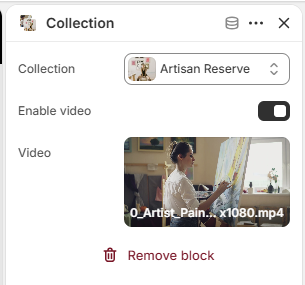
Collection: Select the collection to display in the carousel.
Enable video: Enable or disable video playback for the collection.