

Location: Customizer > Template > Featured Product
Featured Product
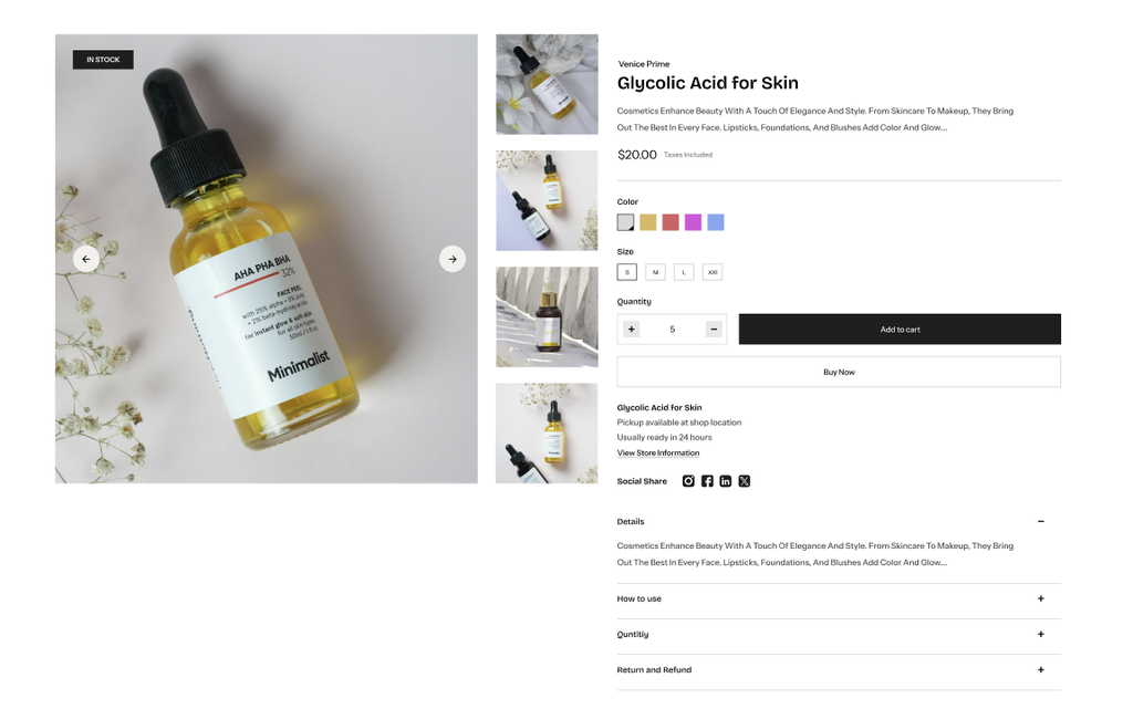
The Featured Product section allows you to showcase a selected product with customizable media, content, and product information blocks.
Featured Product settings
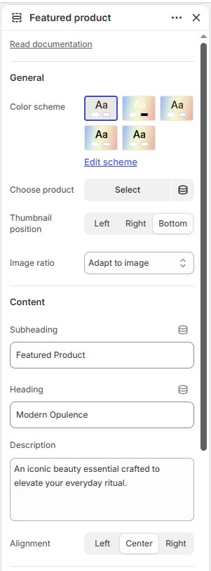
General
Color Scheme: Select the color scheme for the section.
Choose Product: Select the product to display in the section.
Thumbnail Position: Choose the thumbnail position: Left, Right, or Bottom.
Image Ratio: Choose the product image ratio: Adapt to image, Square, Portrait, or Landscape.
Content
Subheading: Add a subheading for the featured product.
Heading: Add the main heading for the section.
Description: Add a description for the featured product.
Alignment: Choose the content alignment: Left, Center, or Right.
Border Radius
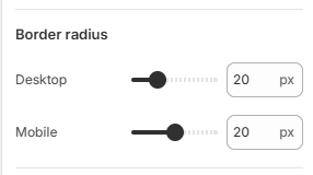
Desktop: Set the image border radius from 0–80px on desktop devices.
Mobile: Set the image border radius from 0–40px on mobile devices.
Padding
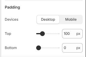
Devices: Choose whether to configure padding for Desktop or Mobile devices.
Top: Set the top padding of the section from 0–500px.
Bottom: Set the bottom padding of the section from 0–500px.
Featured Product Blocks
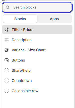
The Featured Product section includes the following blocks:
Title – Price
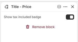
Displays the product title and price, with an option to show a tax-included badge.
Description
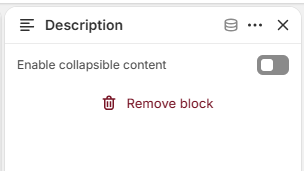
Displays the product description.
Countdown
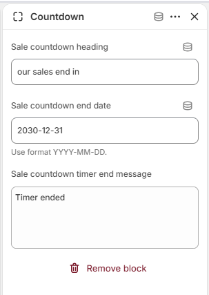
Display a countdown timer for the product.
Variant – Size Chart
Add a size chart for product variants.
Buttons
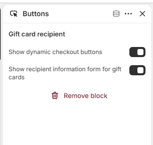
Add customizable action buttons.
Share/Help
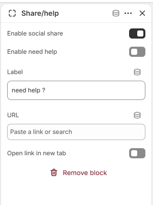
Add product sharing and help options.
Collapsible Row
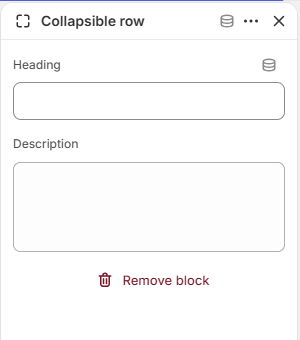
Display additional information in expandable rows.