

Location: Customizer > Text with Icon
Text with Icon Overview
The Text with Icon section allows you to showcase multiple content items with an icon, heading, and description. Each item can also include an optional background image and link.
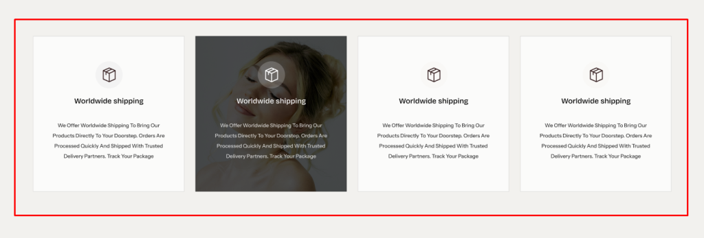
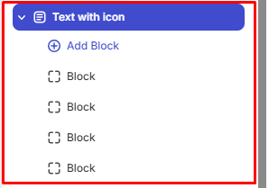
The section uses a block-based architecture, allowing multiple Text with Icon blocks to be added and customized individually.
General Settings
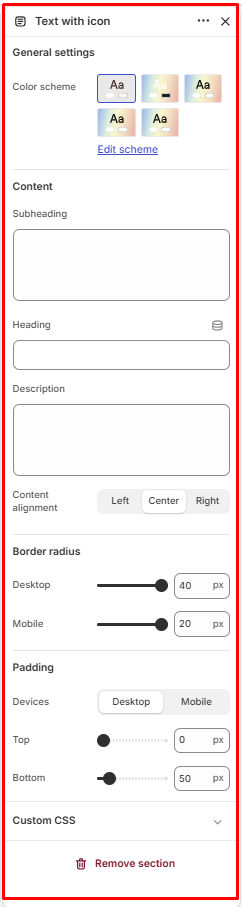
Color Scheme
Allows you to select the color scheme used for the Text with Icon section.
Subheading
Allows you to add a subheading for the Text with Icon section.
Heading
Allows you to add the main heading for the Text with Icon section.
Description
Allows you to add supporting description text for the Text with Icon section.
Content Alignment
Controls the horizontal alignment of the section content.
Available options:
- Left
- Center
- Right
Border Radius
Controls the corner rounding of the Text with Icon items.
Desktop: Available range: 0–40 px
Mobile: Available range: 0–20 px
Padding
Controls the spacing around the Text with Icon section.
Device: Select the device you want to configure:
- Desktop
- Mobile
Top: Controls the spacing above the Text with Icon section.
Available range: 0–500 px
Bottom: Controls the spacing below the Text with Icon section.
Available range: 0–500 px
Text with Icon Blocks Configuration
The Text with Icon section supports multiple blocks. Each block represents an individual Text with Icon item and can be customized independently.
Text with Icon Block
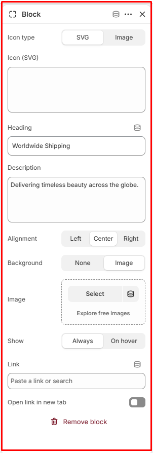
The Text with Icon block allows you to add an icon along with heading and description content. Each block can also have its own background image and link.
Icon Type
Allows you to select the type of icon to display on the Text with Icon card.
Available options:
- SVG: Allows you to enter SVG markup to display as the icon.
- Image: Allows you to upload an image to be displayed as the icon.
Heading
Allows you to add a heading for the Text with Icon block.
Description
Allows you to add supporting description text for the Text with Icon block.
Alignment
Controls the horizontal alignment of the block content.
Available options:
- Left
- Center
- Right
Background
Controls the background type of the Text with Icon block.
Available options:
- None
- Image
Image
Allows you to select the background image for the Text with Icon block.
Show
Controls when the background image is displayed.
Available options:
- Always: Displays the background image by default.
- On Hover: Displays the background image when the user hovers over the block.
Link
Allows you to add a link to the Text with Icon block.
Open Link in New Tab
When enabled, the linked page opens in a new browser tab.