

Location: Customizer > Media Grid
Media Grid Overview
The Media Grid section allows you to showcase multiple media items in a flexible grid layout. Each media item can include an image, heading, and optional button.

The section uses a block-based architecture with a locked Background Heading block and a locked Grid block. Individual Media blocks can then be added within the Grid to build the media layout.
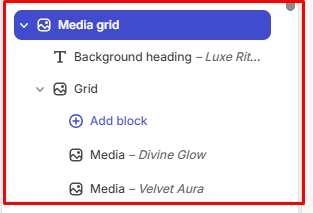
General Settings
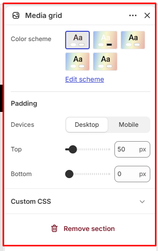
Color Scheme
Allows you to select the color scheme used for the Media Grid section.
Padding
Device: Select the device you want to configure:
- Desktop
- Mobile
Top: Controls the spacing above the Media Grid section.
Available range: 0–500 px
Bottom: Controls the spacing below the Media Grid section.
Available range: 0–500 px
Media Grid Blocks Configuration
The Media Grid contains the following blocks:
- Background Heading
- Grid
These blocks are locked to maintain the intended section structure.
Background Heading
The Background Heading block allows you to add a large decorative heading behind the media grid content.
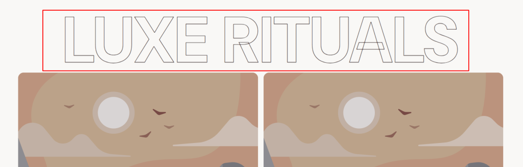
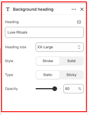
Heading
Add the text to be displayed as the background heading.
Heading Size
Controls the size of the background heading.
Available options:
- Small
- Medium
- Large
- X-Large
- XX-Large
Style
Controls the visual style of the background heading.
Available options:
- Stroke: Displays the heading as outlined text.
- Solid: Displays the heading as filled text.
Type
Controls how the background heading behaves while scrolling.
Available options:
- Static: Keeps the background heading in its normal position as the user scrolls.
- Sticky: Keeps the background heading fixed within its container while scrolling until the container end
Opacity
Controls the transparency of the background heading.
Available range: 0–100%
Grid
The Grid block controls the overall layout and appearance of the media items.
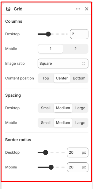
Columns
Desktop: Controls the number of columns displayed on desktop devices.
Available range: 1–4 columns
Mobile: Controls the number of columns displayed on mobile devices.
Available range: 1–2 columns
Image Ratio
Controls the aspect ratio of images displayed within the grid.
Available options:
- Adapt to Image
- Square
- Portrait
- Landscape
Content Position
Controls the vertical position of the media content within each grid item.
Available options:
- Top
- Center
- Bottom
Spacing
Controls the gap between media items in the grid.
Desktop: Choose from:
- Small — 10 px
- Medium — 20 px
- Large — 30 px
Mobile: Choose from:
- Small — 10 px
- Medium — 20 px
- Large — 30 px
Border Radius
Controls the corner rounding of the media items.
Desktop: Available range: 0–80 px
Mobile: Available range: 0–40 px
Media
The Media block is nested within the Grid block and represents an individual item in the Media Grid.
Multiple Media blocks can be added to create the desired grid layout.
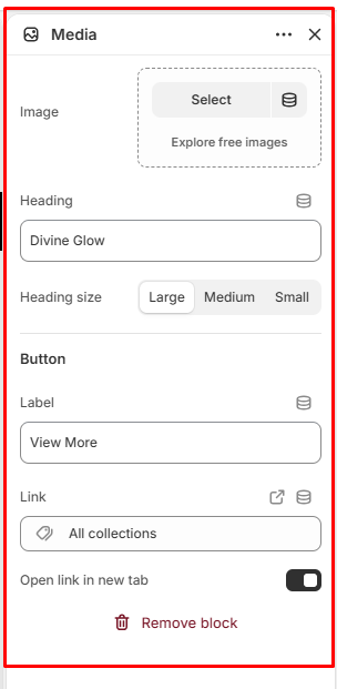
Image
Allows you to select the image displayed within the media item.
Heading
Allows you to add a heading for the media item.
Heading Size
Controls the size of the media item heading.
Available options:
- Large
- Medium
- Small
Button
The Button settings allow you to add a call-to-action link to an individual media item.
Label
Enter the text displayed on the button.
Link
Add the destination URL for the button.
Open Link in New Tab
When enabled, the linked page opens in a new browser tab.
Media Grid Architecture
The Media Grid uses a structured block hierarchy:
Media Grid
├── Background Heading (Locked)
└── Grid (Locked)
├── Media
├── Media
├── Media
└── Media